Promotional Data Mapping
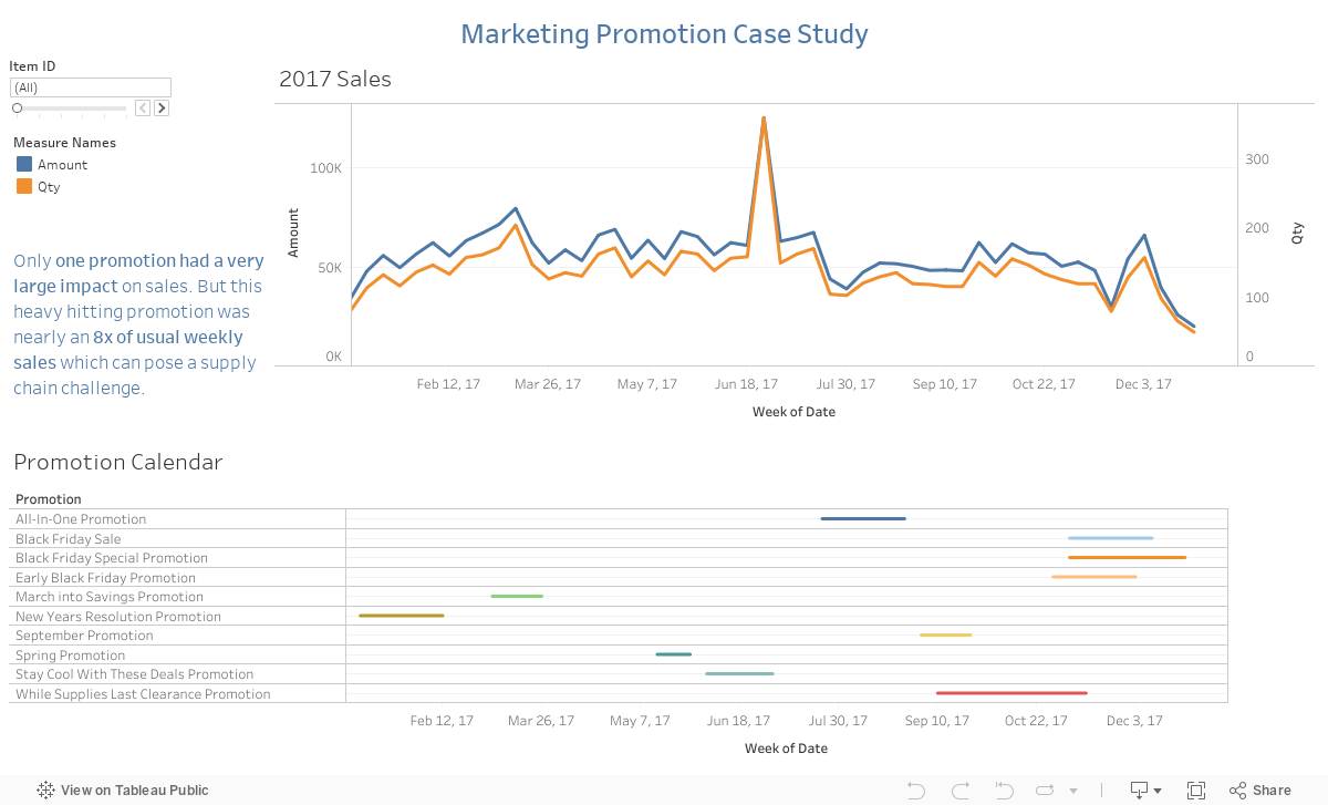
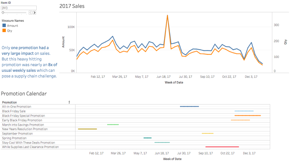
Are your promotions actually having an impact? We can analyze that through visual analytics by mapping sales trends on top of a promotional calendar. Quantifying the impact of a marketing campaign can be hard to quantify. With this type of analysis, we get a 10,000 foot view of both the promotions that are running and the peaks and valleys of an organization’s sales trends.
Zeroing In On Your Promotional Calendar
Do you find yourself struggling to measure performance because you don’t have a way to track marketing through to the end sales (a luxury most e-commerce companies have through tools like Google Analytics)? Don’t fret, Silvertone has a solution. Interactive promotional dashboards like the one we’ve created below provide a cross-section of your promotional calendar over the course of the year.
Sales VS Promotion Dashboard Specifics
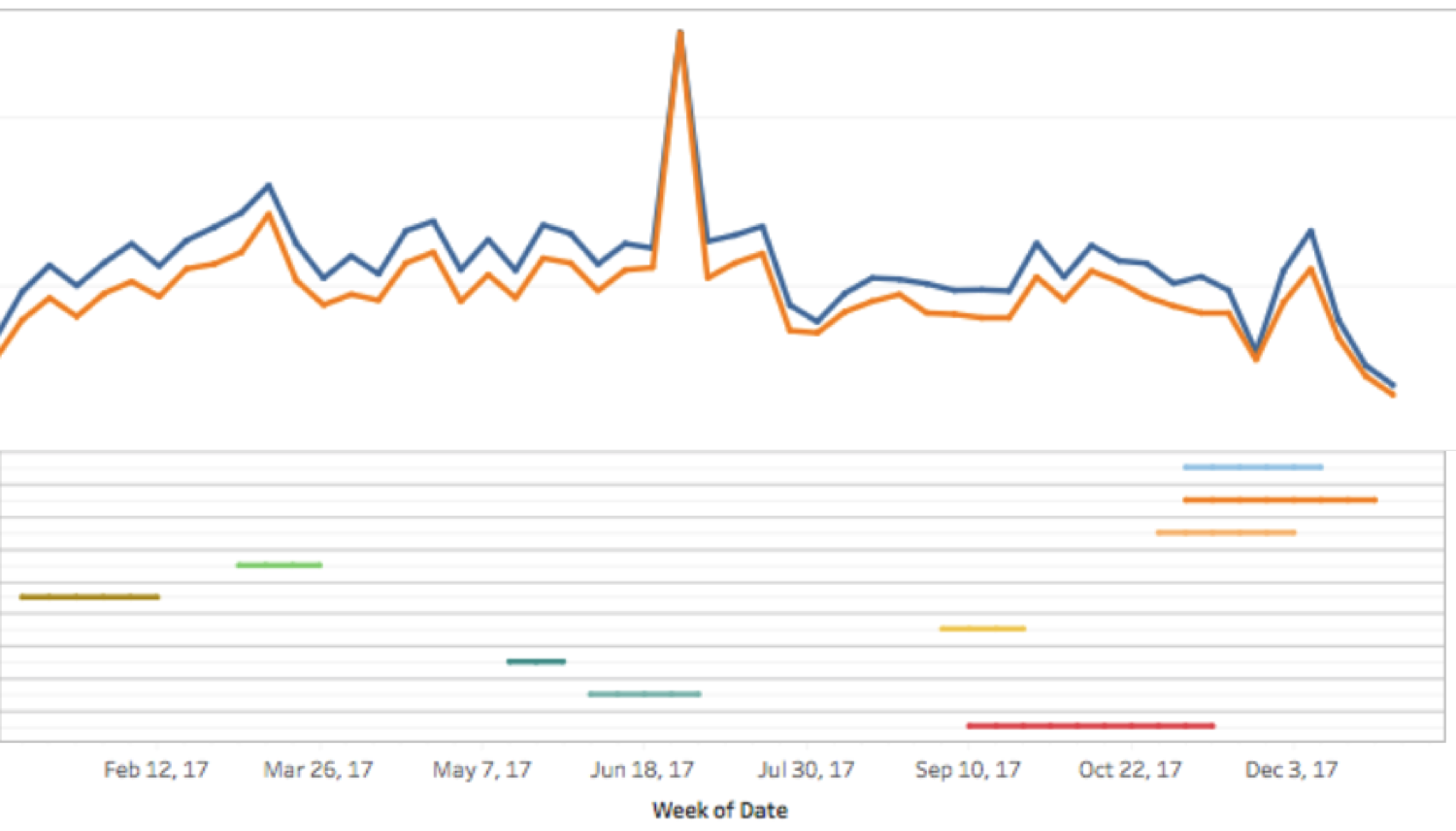
The image shown here tells quite the story about how sales performed based on specific promotions. See the peak during the summer months? This client had been running a variety of promotions throughout the year, spending about the same amount of money on each to drive traffic to their 3rd party distributors. This particular promotion was a big summer sale that included 30% off of a specific product line. They ran similar promotions in mid-March and early December (the other peaks you see). Now they know which lines sell the best and which offers produce the most sales. They can also better plan their inventory for future promotions to make sure those items are in stock.